Both on your user- and on your facility-dashboard widgets help you to get a nice overview of your data. Since it's important to know which widget shows you what kind of information when using them for your dashboard, we created a summary of all available facility-widgets in QBRX. QBRX Widgets can be separated into three categories: Information, Data point and Analyses widgets. In the following article, we'll be talking about the first two kinds of widgets, which are also known as facility-widgets.
Those widgets are your source for general information about your facilities. This includes properties, uploaded documents and issues. Documents | 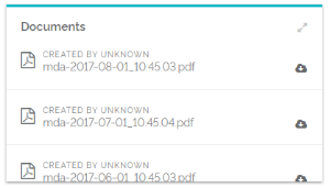 Image Modified Image Modified
| You can upload documents, which other user can download later on. The widgets shows you some of them in a compact form. | Gallery | 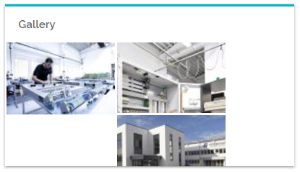 Image Modified Image Modified
| When uploading pictures in documents, they are automatically added to your gallery. The widget displays some of them in a compact form. | Issues | 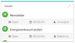 Image Modified Image Modified
| Issues can be created and edited in the facility-menu. The widget shows you some of them, so you won't forget your tasks. | Map | 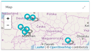 Image Modified Image Modified
| Once you have added an address to your properties, the matching facility-widget will show you the fitting place on an map. | Messages | 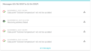 Image Modified Image Modified | The widget for messages displays the most recent messages of your chosen facility and, if necessary, of its sub-facilities. The link "all messages" brings you to the message overview. | Properties | 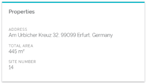 Image Modified Image Modified
| At "properties" you can note down the basic data of your facility. The widget will simply show you some of the information. |
In data point widgets your data is analyzed and evaluated in many different tables and charts. Annual load curve diagramm | 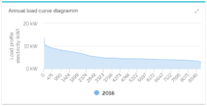 Image Modified Image Modified
| The annual load displays values of a data point, declining from highest to lowest of the year. | Comparison charts for data points | 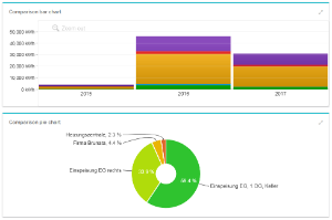 Image Modified Image Modified
| To compare data points with the same meanings with each other, you can use different chart widgets. At the moment, they can be compared in bar and pie charts. | Comparison charts for sub-facilities | Image Modified | To compare different child-facilities of one parent-facility with each other, you can also use two chart widgets: a bar and pie chart. | | Aktuelle Datenpunktwerte | 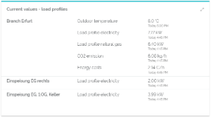 Image Modified Image Modified
| The widget for current values displays the most recent values of data points of a facility and its sub-facilities. Evaluated data points have to be marked as "important". | Current value | 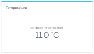 Image Modified Image Modified
| This widget displays the current value of one data point. It is, for example, used to show the outside temperature of sites. | Gauge chart | 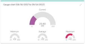 Image Modified Image Modified
| Displays the current value of a data point, just like minimum, maximum and average values of a chosen period. | Heatmap | 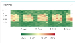 Image Modified Image Modified
| The widget displays chromatic data expressions of a data point compared to a color scale depending on a certain period of time. | Histogramm | 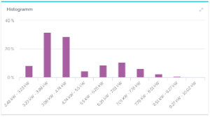 Image Modified Image Modified
| Shows the frequency distribution of values of a data point. | Peak value table | 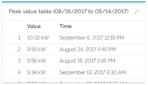 Image Modified Image Modified
| This table displays a ranking of load peaks for a certain period. | | Pivot table (facility comparison) | 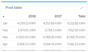 Image Modified Image Modified | The total value of years and months are shown in this table. | Pivot-Tabelle (Zeitraumvergleich) | 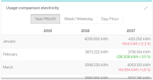 Image Modified Image Modified
| Data point value tables display values of a chosen data point within certain periods of time. | Ratio of two data points | 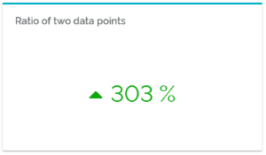 Image Modified Image Modified
| Compares two data points with each other to create a common percentage value. | Relation chart | 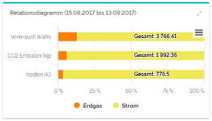 Image Modified Image Modified
| In the relation chart, you can see the percentage of certain data points of a shared value. | Time chart | 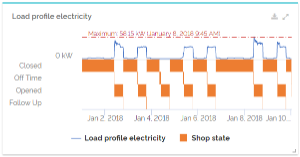 Image Modified Image Modified
| A chart that shows the elapsed time of a data point. The lowest and highest values will also be foregrounded. In this chart, you can evaluate numeric and boolean data points, as well as enumerations at the same time. |
|