The load duration curve is a chart which displays your requirement of energy based on the respective time you inquired it. Thus it shows how many hours a year you consumed a specific amount of energy. In a load duration curve the highest value should optimally be on the far left side and the lowest value on the far right side. This way, you consumed a lot of energy for less hours a year and a low amount of energy for many hours. 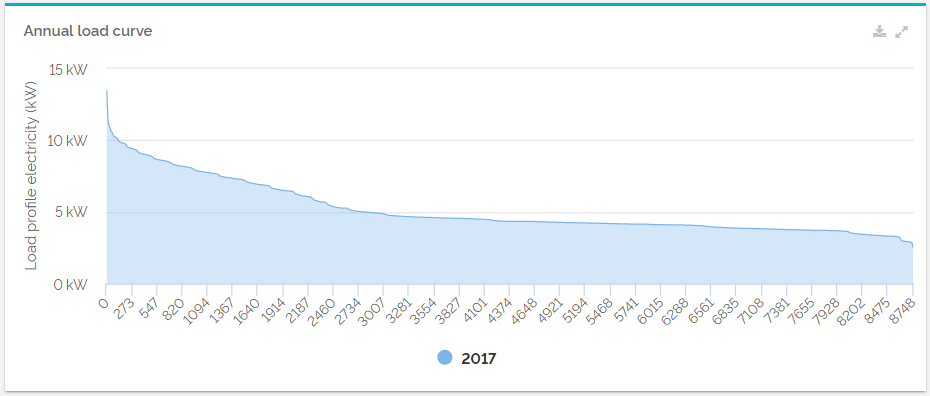
Configuration| Configuration options | Explanation |
|---|
| Title | The name of your widget that will be displayed in the upper left corner. The title can be used to give a precise description of its content and make an analysis more efficient. | | Data point | Choose a data point that should be evaluated as an annual load curve. The options "relative" and "absolute" just indicate the way in which the QRL of your data point is displayed. If you want to know more about this topic, take a look at our articles about QRLs.. | | Amount of diagrammed meters | You can compare power requirements of different years in one annual load curve. Here you can decide, how many years you would like to compare. |
|