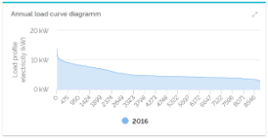
Annual load curve diagramm | | The annual load displays values of a data point, declining from highest to lowest of the year. |
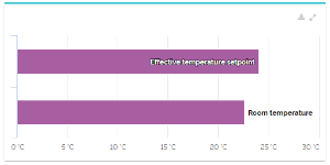
| Bar chart (data point comparison) | | You can compare different data points of your chosen facility in this widget. |
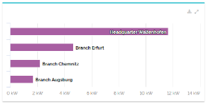
| Bar chart (facility comparison) | | This chart enables you to compare the values of one meaning from different facilities with each other. |
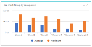
Bar chart (grouping by data points) | | This bar chart enables you to group numeric data points by discrete data points, i.e. boolean data points and enumerations. The bar chart is suitable for quick, clear comparisons of data groups. |
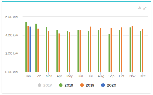
| Bar chart (yearly comparison) | | This widget allows you to compare the monthly values of data points with each other, The number ad range of years are adjustable. |
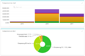
Comparison charts for data points | | To compare data points with the same meanings with each other, you can use different chart widgets. At the moment, they can be compared in bar and pie charts. |
Comparison charts for sub-facilities | | To compare different child-facilities of one parent-facility with each other, you can also use two chart widgets: a bar and pie chart. |
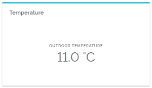
Current value | | This widget displays the current value of one data point. It is, for example, used to show the outside temperature of sites. |
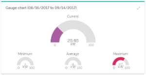
Gauge chart | | Displays the current value of a data point, just like minimum, maximum and average values of a chosen period. |
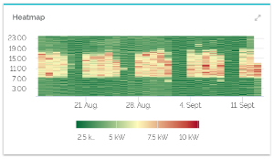
Heatmap | | The widget displays chromatic data expressions of a data point compared to a color scale depending on a certain period of time. |
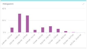
Histogramm | | Shows the frequency distribution of values of a data point. |
| Hot dog chart | 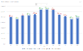 Image Added Image Added
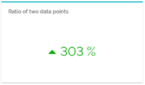
| With this widget you can set two data points in relation to each other. The relative and absolute difference is displayed. |
| Important data points | 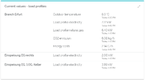 Image Modified Image Modified
| The widget for important data points values displays the most recent values of data points of a facility and its sub-facilities. The widget gives you a practical overview of current values of your important data points. Evaluated data points have to be marked as "important". |
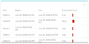
Peak value table | 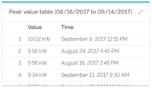 Image Modified Image Modified
| This table displays a ranking of load peaks for a certain period. |
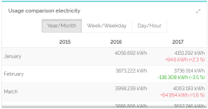
| Pivot table (facility comparison) | 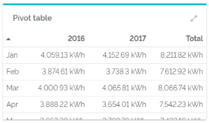 Image Modified Image Modified | The total value of years and months are shown in this table. |
Pivot-Tabelle (Zeitraumvergleich) | | Data point value tables display values of a chosen data point within certain periods of time. |
Ratio of two data points | | Compares two data points with each other to create a common percentage value. |
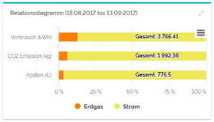
Relation chart | | In the relation chart, you can see the percentage of certain data points of a shared value. |
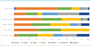
| Relation chart (duration of state) | | In this chart, boolean data points and enumerations are put in relation to each other to display the duration of their respective states. |
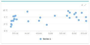
| Scatter Plot | | A scatter plot represents pairs of values of two data points in a chart. |
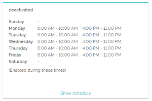
| Schedule | | This widget shows you a chosen schedule of your facility and its current value. |
| Table (grouping by data point) | | The table enables you to group numeric data points by discrete data points, i.e. boolean data points and enumerations. It is a practical way to display in-depth analysis of data groups. |
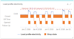
Time chart | | A chart that shows the elapsed time of a data point. The lowest and highest values will also be foregrounded. In this chart, you can evaluate numeric and boolean data points, as well as enumerations at the same time. |