| Sv translation | ||||||||||||||
|---|---|---|---|---|---|---|---|---|---|---|---|---|---|---|
| ||||||||||||||
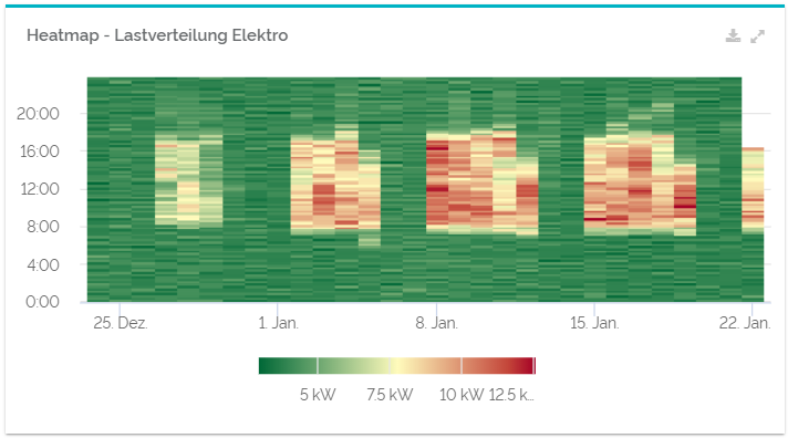
ndlic Eine Heatmap ist eine Art der graphischen Darstellung, bei der die Werte Ihrer Daten ausgewertet und daraufhin bestimmten Farben zugeordnet werden. Heatmaps eignen sich besonders gut dazu, Lastverteilungen über größere Zeiträume hinweg übersichtlich darzustellen. Bei QBRX werden Heatmaps ebenfalls dazu genutzt, Ihre Lastverteilung ansprechend darzustellen. Hohe Werte werden dabei in rötlicheren Tönen dargestellt und niedrige Werte in grün. So können sie leicht nachvollziehen, zu welchen Zeiten sie einen hohen Verbrauch haben. Intervalle und Stoßzeiten können dank Heatmaps einfach erkannt und ausgewertet werden. Widget
Das Diagramm kann als pdf-, svg-, und png-Datei exportiert werden, wenn Sie den Download-Button oben rechts im Widget anklicken. Das "Widget vergrößern"-Symbol daneben um öffnet die Heatmap vergrößert in einem neuen Fenster zu öffnen. Konfiguration
Aggregation | Die Aggregation von Daten bestimmt, wie sie in Diagrammen zusammengefasst und dargestellt werden. Der Durchschnittswert zeigt den Durchschnitt aller gemessenen Werte an. Das Maximum ist der höchste und das Minimum der niedrigste aller eingebundenen Werte. Für das Integral werden Ihre Daten neu berechnet, so dass beispielsweise der Lastgang des Energieverbrauchs in kWh statt kW angezeigt wird
|
| Sv translation | |||||||||||||
|---|---|---|---|---|---|---|---|---|---|---|---|---|---|
| |||||||||||||
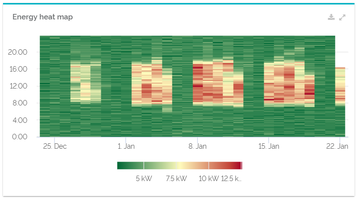
A heatmap is a graphic presentation that evaluates the values of your data and assigns it to matching colors. Heatmaps are a practical way to display load distribution over a certain period of time. QBRX also uses heatmaps to display your load distribution in an appealing way. High values are mostly colored in red and low values in green. This way, you can comprehend at what time you normally have a high consumption. Intervals and rush hours can easily be detected and evaluated.
The chart can be exported as a .pdf, .svg and .png data by selecting te download button in the upper right corner. The "Expand widget" symbol opens the heatmap in a new, bigger dialogue. Configuration
Aggregation | The way in which the aggregated values are calculated depends on what you want to use them for. You can see the average of all measured values. The maximum will give you the highest value and minimum the lowest. The integral evaluates your values to hourly rates, for instance, to get the load profile of your energy consumption in kWh instead of kW
|