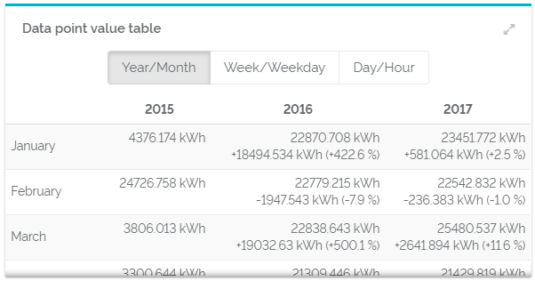
Pivot tables for time period comparisons display values of a chosen data point within certain periods of time. Just like a pivot table, you can use this table to see single data point values and total numbers. This table displays single data points values and total numbers. It also shows absolute and relative differences of values. Like this, you can immediately see and analyze your data over time. For an even better analysis, you can switch between three different analysis options.
Widget This pivot table displays the values of one data point aggregated to certain periods of time. They are evaluated to show each month per year, weekday per weak and hour per day. You can switch between these evaluation options with buttons above the table. Sometimes, your widget is not big enough to display all data. This is shown by thin shadows at the right and lower edge of the widget. Select the "Expand widget"-Button at the upper, right corner, if you want to see the whole table.  Image Removed Image Removed Image Added Image Added
Configuration| Titel | The name of your table. It will be shown in the upper left corner of your widget. The title does not influence the content of your widget. However, it can be used to give a precise description of its content and make an analysis more efficient. | | Data point | Choose a data point that should be evaluated in your widget. You can only choose data points of your current facility and its sub-facilities. The button "relative" and "absolute" switches between two ways of displaying the meaning of the data point. These options are relevant for copying. However, you choice has no influence on the representation of the data point in the table. | | Aggregation | The aggregation determines the way your data is summarized. | | Default view | Choose between three analysis options which one should be displayed at first by default. No matter which one you take, you can still switch between them at all times. The first unit stands for the column (e.g. year), the second for rows (e.g. month). | | Number of columns | Determine the number of columns that should be displayed in your table. | Show absolute differences | When activated, it displays the absolute, real differences in comparison the left value in the same row. | Show relative differences | When activated, it displays the relative, percentage differences in comparison the left value in the same row. | Show totals | When activated, it displays the total of a column at its end. |
| 
