A heatmap is a graphic presentation that evaluates the values of your data and assigns it to matching colors. Heatmaps are a practical way to display load distribution over a certain period of time. QBRX also uses heatmaps to display your load distribution in an appealing way. This way, you can comprehend at what time you normally have a high consumption. Intervals and rush hours can easily be detected and evaluated. 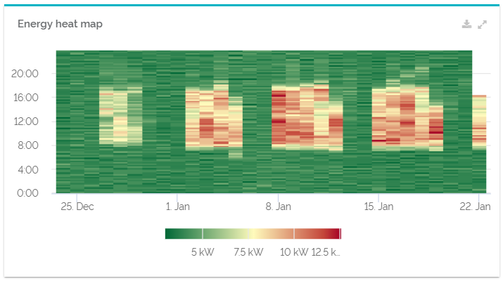
The chart can be exported as a .pdf, .svg and .png data by selecting te download button in the upper right corner. The "Expand widget" symbol opens the heatmap in a new, bigger dialogue.
Configuration| Configuration options | Explanation |
|---|
| Title | The name of your heatmap that will be displayed in the upper left corner of the widget. The title can be used to give a precise description of its content and make an analysis more efficient. | | Meaning | The meaning indicates in which way the data of your heatmap should be evaluated. | | Show hourly values on y-axis | By activating this option, the values of your heatmap will be evaluated and displayed for full hours instead of every 15 minutes. | | Use default colors | Activate this checkbox to use the default colors for heatmap analysis. Deactivate the checkbox to choose your own colors for minimum and maximum values. | | Calculate minimum and maximum automatically | A tick in this checkbox indicates, that the highest and lowest values will automatically be calculated. Deactivate the checkbox to set your own limit values for minimum and maximum. This option is helpful, whenever extremely high or low values cause a distortion the color scale of your heatmap. |
|